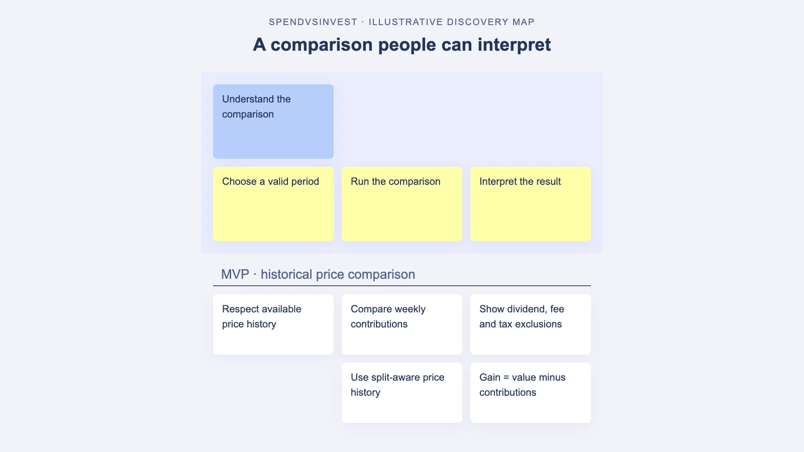
I wanted SpendVsInvest to make a familiar question tangible: what might regular spending have looked like if the same amount had gone into an investment instead?
The visible product is small: enter a weekly amount, choose a stock and start date, then watch the historical comparison unfold. A convincing chart is easy to imagine. A precise sentence explaining what it means takes more work.
This case is based on SpendVsInvest’s implementation plan. The dialogue and story map reconstruct the discovery questions; they are not evidence of a recorded MCP session.
One word changes the claim
Me: Show what the investment would have returned.
Agent: Does “returned” include dividends?
Me: The data has dividend records. Can we include them?
Agent: Are those records adjusted consistently with the price and stock-split data?
This reconstructed exchange gets to the consequential question. The plan records inconsistent adjustment bases in the available dividend history. The chosen MVP therefore uses price return and excludes dividends. It also excludes fees and taxes.
Those exclusions belong beside the result. They change the claim the product can make. Calling the output a historical price-based comparison is more accurate than letting “return” imply everything an investor might have received.
The explanation belongs in the journey
The original ambition reached back to 2000, but the selected data starts in 2011. The implementation direction respects available history instead of inventing earlier prices. The user needs a valid start date before the animation begins.
That is why my map fragment starts with choosing the period and ends with interpreting the result. Calculation sits between them.
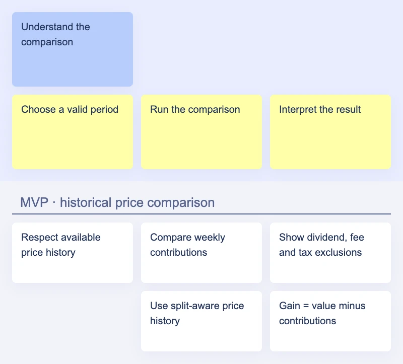
Another small trap lives in the picture itself. If spending is drawn below zero and the investment value above it, the distance between the lines is not investment gain. In this product, gain means portfolio value minus the amount contributed. A beautiful animation cannot settle that definition.
Turn the claim into acceptance criteria
For a story-refiner pass, I would start with three checks:
- A comparison cannot fabricate prices before the selected stock’s available history.
- The result clearly says dividends, fees, and taxes are excluded.
- The displayed gain equals portfolio value minus contributions, regardless of where the chart lines sit.
The broader finance-app requirements guide covers missing states and recovery paths. This example zooms in on something smaller: whether one number says what the interface implies.
In a StoriesOnBoard workflow, I would confirm those assumptions in discovery, review the proposed cards, and then use the MCP connection to carry authorized changes to the map. A scoped refinement pass and read-back keep the definition attached to the story.
The useful agent question is almost disappointingly ordinary: “What exactly does this number include?” I would rather answer it while planning than after a polished chart has taught people the wrong thing.